Is Data Visualization the Future of Art?
“Why are we picking at these carcasses of creativity?” Holly Finn asks in a recent Wall Street Journal article, pointing her critical finger at the particular corpse of Damien Hirst’s creative corpus currently on show at the Tate Modern. “We should instead be celebrating the really new and relevant: the rise of the data visualizers. Their medium is the one with momentum, the one genuinely changing how we think and feel. And it’s about to boom.” More than just more Hirst bashing, Finn’s article, titled “Making Data Beautiful,” raises the question of whether old fashioned art is dead and today’s art should be as digital and information driven as our world. If hands-on art (including even Hirst’s hands-free version) is a thing of the past, is data visualization the future of art?
Finn provides plenty of examples of fascinating, mind-boggling, data visualization as art. Gareth Lloyd’s “A History of the World in 100 Seconds” takes over 14,000 geo-tagged Wikipedia articles dealing with topics from 499 B.C. to today. Data points flash slowly at first in certain areas, but when the fireworks begin in the Americas, you really begin to see how history exploded in the days of European colonization of the New World and hasn’t let up since. Another memorable history lesson as data visualization comes from Hans Rosling’s Gapminder website. In the animation of data on the wealth and health of nations from 1800 on, life expectancy is plotted against individual income, with each region of the world represented by a colored bubble commensurate to their population. The colored bubbles bounce about in a roiling boil in a general rise towards general greater wealth and health, but the fullness of the bumpy ride to the present, and continued gaps between different parts of the world, is crystal clear. Both educational and entertaining, such works grab the mind while pleasing the eye—the perfect pedagogy.
Finn describes this different feel to data visualization art versus “old” art focused on pleasure or aesthetics. “[T]he goal of data-driven digital artists is clear, not cynical: convey complex concepts quickly and crisply,” Finn writes. “They want to generate not Art-with-a-capital-A, necessarily, but understanding. They take stone-cold data—units of information—and turn them into something warmly communicative. Beautiful, too. So they become a pleasure for us to absorb.” I think Finn’s underestimating the power of “Art-with-a-capital-A” (aka, old-fashioned art) to generate understanding, albeit of the non-data kind, but I get her point. Perhaps the old paradigm of understanding in a religious, spiritual, moral, etc., sense has passed. In the age of the iPad, maybe the truest or most relevant understanding comes in zeroes and ones.
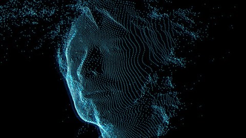
When Finn talks of the “warmly communicative” power of data visualization to “take stone-cold data” and transform it into hot, human terms, I flashed back to Radiohead’s music video for “House of Cards” from the 2008 In Rainbows album. Aaron Koblin, whom Finn interviews in her article, did the data visualization work for that video, which used 3D plotting technologies to collect information about the shapes and relative distances of objects, including lead singer Thom Yorke’s face (shown above), and then visualized the data. The result isn’t robotic or inhumanly alien. Instead, Yorke’s ghostly face perfectly matches the seemingly disembodied nature of his vocals. The fragility described in the lyrics—the perilous “house of cards”—finds shape in the fragile visualization of Yorke’s face as a collection of data points: dust to dust, ashes to ashes, digits to digits.
“It’s not unlike a microscope,” Koblin tells Finn, “taking something you can’t see and bringing it into the scale of perception,” Just as the microscope influenced artists to see the world differently, perhaps data visualization will inspire the “old-fashioned” artists to respond in their medium of choice. Maybe this is finally the end of painting and sculpture, but reports of their deaths have been greatly exaggerated before. I doubt they’ll go without a good fight, or at least an attempt to address this latest paradigm of art. At the very least, people will always need some form of art—capital A or small—to help them bring their world “into the scale of perception,” as Koblin puts it so well.
[Image: Still from Aaron Koblin’s data visualization work on Radiohead’s music video for “House of Cards” on the 2008 In Rainbows album.]