The national debt pizza: How much is your slice?
The people at HowMuch.net call it the Snowball of Debt, but honestly, it looks more like a pizza. Or a vast, boiling vat of paella.
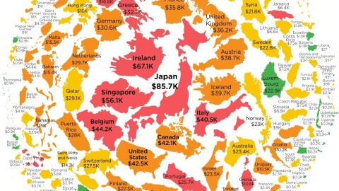
The ingredients are country-shaped. The biggest countries are near the centre, the smallest ones at the edge. Their size does not reflect the relative differences in actual, geographical area – check your atlas: Ireland is not bigger than Germany, and the U.S. is not smaller than Singapore.
The clue is in the dollar amount under each country name: that is how much each citizen owes as a share of their nation’s debt. The bigger that figure, the bigger the country on this pizza. This is what the top ten looks like:
These are all well-developed, high-income nations. Apparently, you need to be rich to be deep in debt. The reverse applies to the other side of the spectrum. The citizens of some of the world’s poorest countries are also the least burdened by national debt. Here is that other top ten:

But the reverse relationship between a nations level of development and its debt is not linear. Some relatively well-developed economies have very low per-person debt levels. Chile, the Czech Republic and Slovakia, for example, bunched together near the right-hand edge of the pizza. The tasty colour-coding provides more evidence of that non-linearity. The colours express the public debt as a share of GDP:
Actually, its a few more than twelve, but why waste a nice alliteration? They include most but not all of the countries with the highest debt per person, and some others much further down that list: Japan, Ireland, Singapore, Belgium, Italy, Greece, Barbados, Cyprus, Jamaica, Portugal, Lebanon, Grenada, Cape Verde and Eritrea.
For more on this map, see here onHowMuch.net.
Strange Maps #811
Got a strange map? Let me know atstrangemaps@gmail.com.