See Which Commodities Make the World Go Round
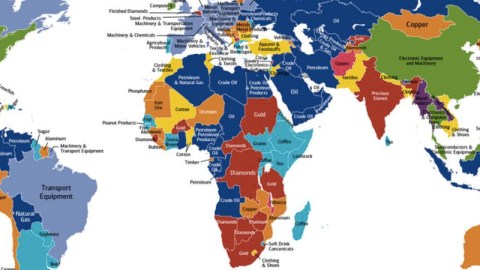
What makes the world go round? Not love or money. Except if it’s the love of oil, and the money to pay for it. This world map shows each country’s main export, excluding services. The results are colour-coded. The map is dominated by blue.
And you guessed it: blue is for petroleum, petroleum products, oil, crude oil… whatever you want to call the black sticky stuff that used to be dinosaurs, powers your pickup and is polluting the planet into oblivion.
The Middle East is almost exclusively blue, and so is Russia, Central Asia, most of North Africa and many other countries on the mother continent, including Nigeria and Angola. Russia’s neighbour Norway is in the club as well, meaning that you could drive all the way from Oslo to Brazzaville, passing only through countries in which oil is the main component of the economy (1).
The Americas also have a cluster of blue countries: Ecuador, Colombia and Venezuela. Bolivia is also blue, but this is for natural gas – another type of hydrocarbon. Oil and gas are also what powers the economy of Indonesia, the economic world power you haven’t heard from – yet (2).
Imagine if all those countries were members of an enhanced OPEC – what clout would the oil-producing and exporting countries have. Perhaps all the other colours would have to merge into their own trade association, to counter the dominance of oil.
The Red League would have a thing or two to say on the world economic stage as well. Red is prominent throughout Africa, but also colours India and Belgium: these countries thrive on precious metals and minerals – gold in South Africa, Burkina Faso, Tanzania, Sudan and Tajikistan; diamonds in Sierra Leone, Namibia, Botswana, DR Congo, the Central African Republic. In Zimbabwe, it’s platinum. No diamonds are mined in Belgium, but its port city of Antwerp is the world centre for trade in the precious stones. India both mines and trades in diamonds.

The Orange Association is also a mining league, but the object here is quantity, not quality: non-precious metals and minerals. Take for example Australia’s main export, coal – representing about 15% of the country’s exports (as well as powering about two-thirds of its own energy plants). Metals and minerals are vital to the economies of Lithuania, Romania and Serbia. Copper is the cash cow for Mongolia, Chile, Peru and Zambia; aluminium for Tajikistan, Surinam, Guinea and Mozambique. Liberia’s main export is rubber, Niger’s is uranium, Mauritania’s iron ore.
Neighbouring Western Sahara, often lumped together with its occupying power Morocco, is phosphate-rich. In fact, the mineral may be a strategic reason for the desert territory’s continued occupation. It’s a reason that’s visible from space: a 60-mile conveyor belt – the longest in the world – transports phosphate rock from mines inland at Boucraa to the port of El Ayun. The belt is visible on Google Maps from the dust that is blown off it by desert winds (see below). Phosphate is an essential component of synthetic fertiliser, without which the world couldn’t feed itself. The resource is finite, and thanks to its occupation of the Western Sahara, Morocco controls almost three quarters of the world’s reserves.

Countries in yellow are members of the far-flung Textile Club. Apparel is the main export for Honduras and Haiti; clothing and shoes power the economies of Mexico and Vietnam; cotton is the main export for Mali, Togo and Benin. Other textile and footwear exporters are Morocco, Tunisia, Turkey, Bulgaria, Albania, Pakistan, Nepal, Bangladesh and Cambodia. And Jordan – bent over the sowing machine while its Arab neighbours revel in oil wealth.
The Light Blue League produces foodstuffs – coffee, tea, livestock and grain in the Horn of Africa; sugar in Guyana and the Dominican Republic; soybeans in Paraguay and Argentina; beef in Uruguay; dairy in New Zealand; fish in Senegal, Guinea Bissau, Greenland and Iceland; peanut products in the Gambia; crawfish in the Bahamas; bananas in Costa Rica (3); tea again in Sri Lanka; and again coffee in Nicaragua, Guatemala and Madagascar. Portugal and Greece live off ‘agricultural products’ and ‘food and beverages’ – which sounds less tasty than olives, ouzo and porto. And in Cyprus, finally (and rhymingly), it’s citrus.
Europe is a Grey Zone: exporting machinery, equipment, vehicles, steel products and the like. Japan, Brazil and Canada are also members of this industrialised club, as is, rather unexpectedly, Papua New Guinea.
Finland joins the U.S. and China as members of the exclusive Electronics League, in green. Laos and Birma/Myanmar form the tiny Wood League – unfortunately, the resolution of the map is too low to reveal which trees are ripped from its forests.
A handful of countries fall into the ‘other’ category: Malawi and Kosovo both benefit from the export of tobacco – in bales from the former country, in cartons from the latter one. Lebanon’s main export is jewellery. And Afghanistan? Despite the efforts of the Afghan government and the international community to stamp out its cultivation: opium – the source of more than 90% of heroin worldwide.
Based on 2014 data from the CIA World Factbook, this map was produced by Bank of America Merrill Lynch for their Transforming World Atlas. Excluding services, it focuses on tangible goods – stuff that actually needs to be transported from A to B. As such, it highlights “how many countries in the world are dependent on commodities as the primary source of foreign income”.
It shows up on this page of the World Economic Forum, which argues that the “significant slowdown” in global trade since the 2008 financial crisis can only be reversed through an effective global trade and investment system, which would boost economic growth and meet global challenges.
Hardly the ascendant position at present, but there you go.
Many thanks to Orion Jones for sending in this map.
Strange Maps #833
Got a strange map? Let me know atstrangemaps@gmail.com.
(1) If you take the ferry from Saudi Arabia to Egypt, that is: a tiny cluster of three small countries strategically places between Africa and Asia does not share in the region’s petroleum wealth – Israel, Jordan and Lebanon.
(2) With a population projected to top 263 million by the middle of this year, Indonesia is the fourth-most populous country in the world, after China, India and the U.S., and way ahead of Brazil (by as much people as live in Italy). With a GDP of about $940 billion, Indonesia ranks 16th in the world, just below Mexico. But by 2050 it is predicted to be the fourth-biggest economy in the world, after China, India and the U.S. (in that order).
(3) Not the original ‘banana republic’. That was the (fictional) Republic of Anchuria in O. Henry’s book ‘Cabbages and Kings‘ (1904), inspired by his stay in Honduras.