Is the Future of Graphic Design in its Past?
If Brad Pitt and Angelina Jolie reign as the premier power couple of Hollywood, then Seymour Chwast and Paula Scher deserve credit as the “Brangelina” of the world of graphic design and illustration for the last half century. In Double Portrait: Paula Scher and Seymour Chwast, Graphic Designers, which runs at the Philadelphia Museum of Art through April 14, 2013, the work of “Schwast” (“Chwer”?) appears together for the first time in an unruly retrospective that, like all retrospectives, points back, but also points forward to where the world of illustration and graphic design might go in the technology-laden future.
Scher and Chwast first met in January 1970, when Scher, a senior at the Tyler School of Art in Philadelphia, showed Seymour, already an established illustrator, her portfolio on the recommendation of Pushpin art director Harris Lewine. Three years later, they married. Five years after that, they divorced. A decade after that, they remarried. Regardless of marital status, the influence between their bodies of work remained strong, despite the fact that they’ve never collaborated on a project. That same separate but equal policy holds true in the layout of the Double Portrait exhibition: Chwast’s bio (accompanied by a giant, rounded “a” designed by him) and posters cover two adjacent walls, while Scher’s bio (accompanied by a giant, streamlined “A” designed by her) and posters cover the two facing, adjacent walls. In the middle sit two tables of non-poster work and screens displaying continuous slideshows of sequential images, 3D objects, and, for Scher, “environmental graphics” such as the exteriors and interiors of businesses, including the “look” of The Daily Show with Jon Stewart. As PMA Director and CEO Timothy Rub pointed out, the entrance to the Double Portrait exhibition, festooned with a comic speech bubble and a flurry of pointing arrows, announces the presence of an “unruly exhibition, in a very polite building.” But the “your side/my side of the bed” ordered unruliness continues well after you walk through the doorway.
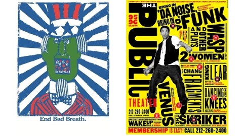
Scher’s work strikes you with the clean lines and vibrant energy of text and image working together. “Words have meaning and type has feeling,” Scher believes. “When you put them together it’s spectacular.” Scher’s 1995-96 Season campaign poster for The Public Theater (shown above, at right) announces the coming of Bring in ‘da Noise, Bring in ‘da Funk and other shows to the New York-based The Public Theater. About two thirds of Scher’s posters belong to her work with The Public Theater, but it’s this image of Savion Glover bursting out with text dancing around him that perfectly captures Scher’s talent for making text not just feel, but move, and thus move the viewer.
Chwast’s posters continue the best tradition of the poster as a means of mass communication. (He credits German Expressionists such as Ernst Ludwig Kirchner, George Grosz, and Otto Dix as influences for his anti-war illustrations.) The illustrator wistfully recalled during the press preview the days of the 1960s-era poster shop, when collectors could pick psychedelia or political protest to adorn their walls and feed their heads. Chwast regretted the passing of the poster as a political statement—a kind of visual haiku where “ideas have to be compressed, direct, short” to catch the eyes of passersby. End Bad Breath (shown above, at left) came to life from Chwast’s anger over the US bombing of Hanoi during the Vietnam War. Uncle Sam’s bad breath comes from overuse of carpet bombing—a social faux pas of epic proportions that Chwast mocks in his satire of commercial advertising. In another anti-Vietnam war poster, War Is Good Business: Invest Your Son, Chwast mixes Victorian wood-block typography, photography, and bright colors into an eclectic, energetic, sarcastic visual sound bite that sinks its teeth deeply into the hypocrisy of a war supported by those with no skin in the game.
Although Chwast hasn’t taken on more recent wars with his pen and brush, he continues to create fascinating visual juxtapositions for new audiences, often using the oldest of inspirational materials. Chwast’s graphic adaptations of The Odyssey and The Canterbury Tales breathe new life into the old literary war horses: Ulysses rides a rocket ship on his long and winding road back to Penelope, while the Wife of Bath and friends become a motorcycle gang with a gift for gab. Selections from both books and other adaptations by Chwast appear in the slideshows to tempt you to find the full versions. (I’ve used both in my literature classes and recommend them highly to anyone looking for an introduction or reintroduction to these classics.)
One of the most fascinating aspects of Double Portrait is how it lingers in the past only long enough to say something about the present and the future. Although Scher also laments the passing of the political protest poster, she sees social media assuming a role today in American society as an outlet for loyal dissent. A consultant for Microsoft, Scher commented on how the new Windows 8 look is based on European modernism, with the old print-based look making its way into modern software design. Scher sees many young graphic designers working in a “baroque” style that is more complex and layered than the previous generation’s minimalist approach. As if unruliness had skipped a generation or two, it looks like the visual approach (and, perhaps, social consciousness expressed in those visuals) is making a comeback.
In one of Chwast’s smaller posters, titled “My Best Work,” an artist (clearly based on Seymour himself) draws a beautiful blonde woman (clearly based on Paula), who comes to life and pulls him amorously into the picture. Double Portrait: Paula Scher and Seymour Chwast, Graphic Designers displays not just the best work of these two talented artists whose lives and ideas are so intertwined, but also the best work of the world of illustration and graphic design itself of a once, and perhaps future, era. Life, marriage, and art are messy things, at least if you’re doing them right. Double Portrait reminds us that it’s OK to color outside the lines, if only to question why those lines exist.
[Image: (Left) End Bad Breath, 1967. Seymour Chwast, American, b. 1931. Poster, offset lithograph, 37 x 24 inches; (Right) 1995-96 Season campaign poster for The Public Theater, 1995, by Paula Scher/ Pentagram.]
[Many thanks to the Philadelphia Museum of Art for the image above, an invitation to the press preview for, and other materials related to Double Portrait: Paula Scher and Seymour Chwast, Graphic Designers, which runs through April 14, 2013. Many thanks also to Bloomsbury USA for providing me with review copies of Seymour Chwast’s The Odyssey and The Canterbury Tales. Very special thanks to Mr. Chwast for indulging a long-time fan by autographing my copy of The Canterbury Tales.]
