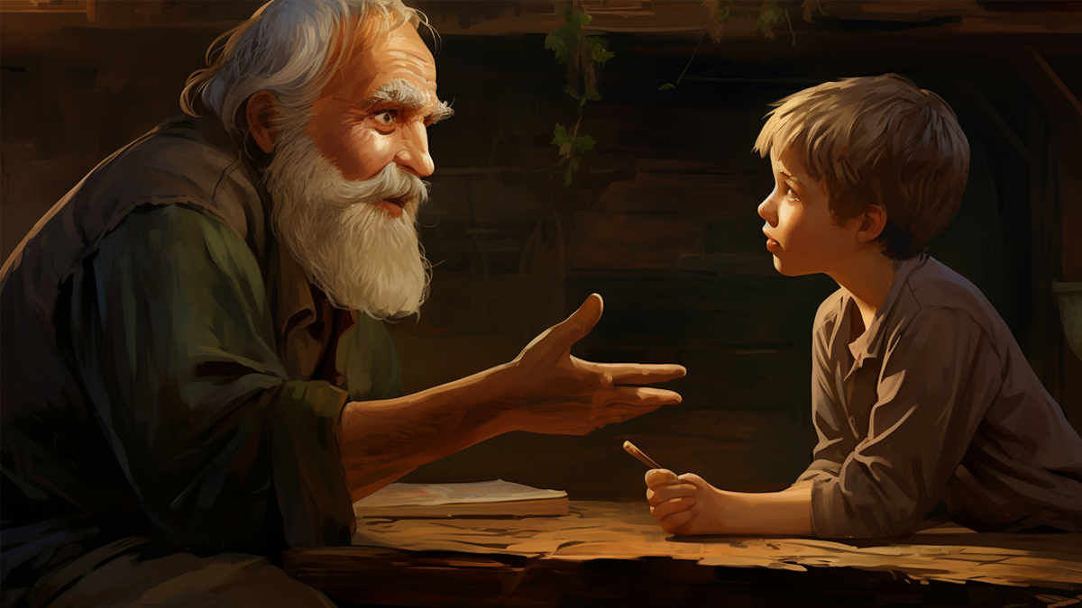
467 - Coming Soon to a Map Near You: the Gulf Spill


Every disaster is always bigger than the last one. Newspapers and tv anchors have to say that, don’t they? Otherwise it wouldn’t be news. But those slick-covered birds look the same every time. A bit distressing, but what’s a pelican for, at the end of the day? To be honest, this disaster is getting a bit boring. Haven’t they capped that well yet?

The Deepwater Horizon oil spill (1) is the worst environmental disaster in US history. But it’s a catastrophe of the creeping, cumulative kind, composed of images familiar from earlier ecocides. How to get a grip on its width and breadth? Obviously: a map. Ingeniously: a map of the area affected by the oil spill transposed on your geographic location of choice – your home, for optimum shock effect.

This simple act of teleportation, by the almost appropriately named website www.ifitwasmyhome.com (2) , puts a stark perspective on the disaster’s geographic impact, now stretching from the coast of Louisiana to the Florida Panhandle. The immediate, visual result is immensely more powerful than crude statistics (3):

Since the explosion of the Deepwater Horizon rig on April 20 (killing 11 crew), over 1 million US gallons have been spilling into the Gulf of Mexico every day, by now adding up to almost 50 million gallons. A recent study by the University of Miami puts the surface of the oil spill at about 10,000 square miles (almost 26,000 square km), or triple its size on May 1st. This means the affected area is rapidly approaching that oft-cited (4) unit of large-surface measurement, the size of Belgium (11,787 sq mi, or 30,528 km2).

The spill’s size is less abstract (and more ominous) if transported from its aquatic domain to a land-based vantage point. Centred on London (placing the gushing wellhead somewhere below Westminster), the area affected by the spill covers most of southern England, almost touching Swansea in Wales and nearly spilling over onto the French coast at Dunkirk. The area does look a lot larger than Belgium, to the spill’s east. One assumes that the calculations of Miami U refer to the darker-shaded areas within the total affected region.

Superimposed on a map of the Los Angeles area (zoomed out a bit more than the London map), spillage threatens to swallow Lompoc, and has engulfed lovely Oceanside – all the while extending as far inland as Death Valley, not too far from the Nevada border.

You too can centre the spillage on your hometown. Go to the website (cf. sup.) See how far you would have  to travel to stay clear of the oily mess. Then zoom out to see how large it is on a global scale (spoiler: quite large!) Maybe not the most uplifting of pastimes, but an intelligent way to impress the scale of this disaster on our minds, saturated as they are by superlatives.

Many thanks to Stannous Flouride for sending in this link.

————-

(1) Or the BP oil spill, if you insist on naming, shaming and/or blaming the guilty.

(2) If it were my home, indeed. There is no need to compound ecocide with grammaticrime.

(3) excusez le pun.

(4) an entire website is dedicated to the recurrence of this rather unusual unit of surface.

blog comments powered by Disqus

Share This Story

About Strange Maps

570 Posts since 2006

Frank Jacobs loves maps, but finds most atlases too predictable. He collects and comments on all kinds of intriguing maps—real, fictional, and what-if ones—and has been writing the Strange Maps blog since 2006, first on WordPress and now for Big Think.  His map "US States Renamed For Countries With Similar GDPs" has been viewed more than 587,000 times. An anthology of maps from this blog was published by Penguin in 2009 and can be purchased from Amazon and Barnes & Noble.


SUBMIT A STRANGE MAP!

Frank can be reached at strangemaps@gmail.com.

Recent Posts